


ToggleButton
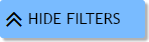
A toggle button with e possible states. When the button switches to 'on', the target element options.targetId becomes visible, otherwise it is hide.


For CSS personalization, see the toggle-button class of the API CSS file
Constructor
ToggleButton
-
options
Parameters:
-
optionsObject-
targetIdStringid of the element which toggles from visible to not visible
-
targetSelectorStringselector for the element which toggles from visible to not visible
-
onLabelStringlabel of the button in 'on' state
-
offLabelStringlabel of the button in 'off' state
-
[beforeStart]Function optionalcallback function to call just before the animation is started
-
[onComplete]Function optionalcallback function to call once the animation is complete
-
[state]Function optionalthe button state
-
-
[width=135]Integer optionalbutton div width
-
[duration=800]Integer optionalnumber expressed in milliseconds determining how long the animation will run
-
[id=GIAPI.random()]String optionalid of the button
-
Methods
css
-
target -
property -
value
Set a CSS property and value for the given target
div
()
Returns this button <div>
setLabel
-
state -
label
Set a particular label for the given state
state
-
state
Set the button state. Possible values are:
- 'off'
- 'on'
- 'disabled'
Parameters:
-
stateString
stateIcon
()
Set the button state icon. Default values are:
- on: 'fa-angle-double-up'
- off: 'fa-angle-double-down'